Growth through presence, in a committed community.
Bjergsnæs - A place in motion.
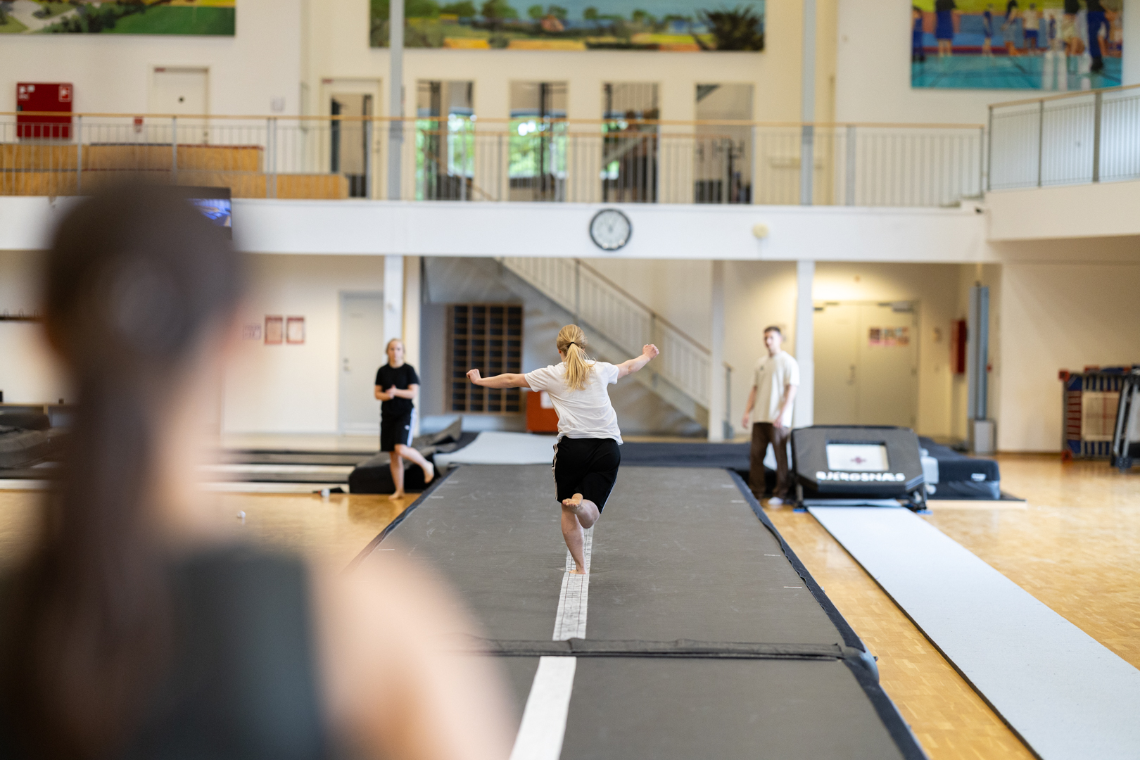
Bjergsnæs Efterskole is a school in motion. Not only because it is one of Denmark’s gymnastics boarding schools, but because movement is central to the school’s personal, academic and organisational development.
The task was to bring what already makes the school distinctive into sharper focus and create a visual and verbal identity that could propel it towards the future.
The result is a new identity built on presence, courage and integrity—with movement as the thread that ties it all together.
- Brand Communication
- Brand Design
- Brand Guardianship
- Brand Guidelines
- Brand Identity
- Brand Research
- Brand Strategy
- Graphical Elements
- Internal/Organisation Film
- Photo Shoot
- Planning
- Wayfinding
- Website
Challenge
Bjergsnæs already had a strong foundation, with a clear culture and deeply held values. What the school needed was a more cohesive visual identity—one that could capture the full Bjergsnæs story and bring what was already there to the fore.
Here, movement is about more than physical activity. It’s about daring to grow, try new things and move forward as a person. About being challenged. And about being part of a community where everyone takes responsibility for themselves and one another.
Solution
The new identity is rooted in Bjergsnæs as a place in motion.
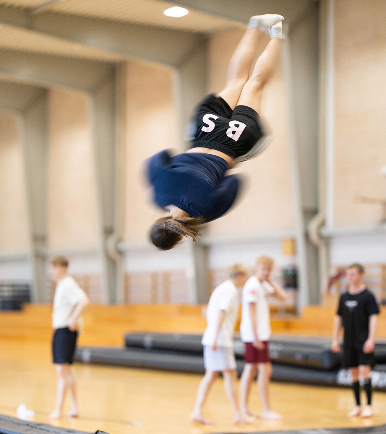
Movement runs through every part of the identity—from the logo and typography to the photography and graphic elements. In some places, it’s bold and energetic; in others, quieter and more present.
This allows the identity to capture both the school’s physical energy and the softer values that shape everyday life and its sense of community.
Logo
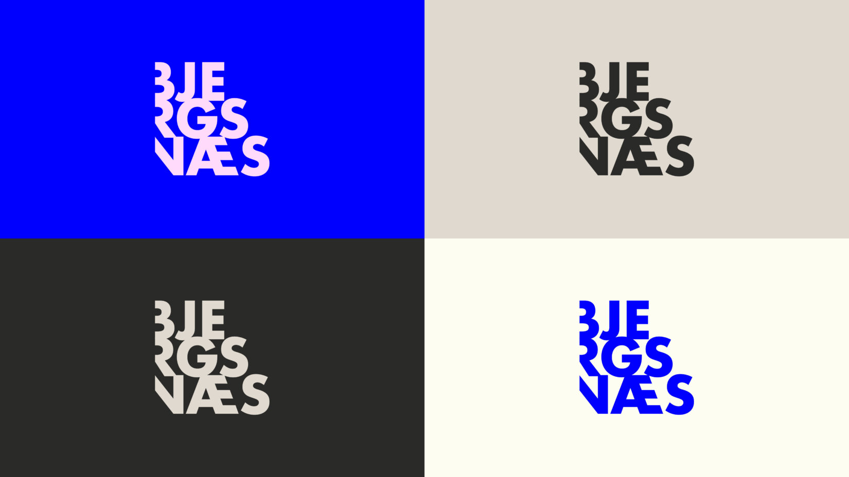
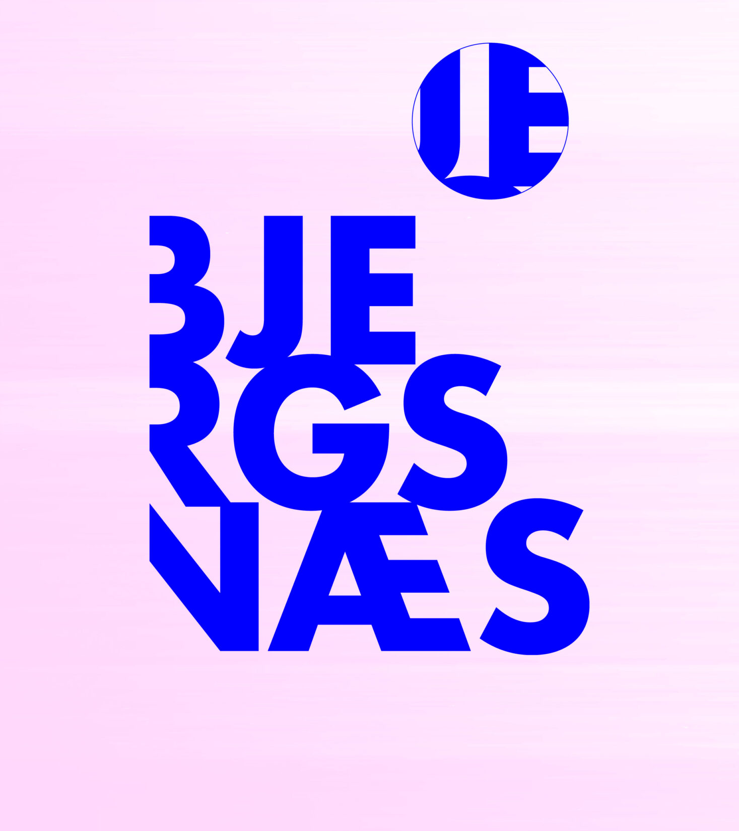
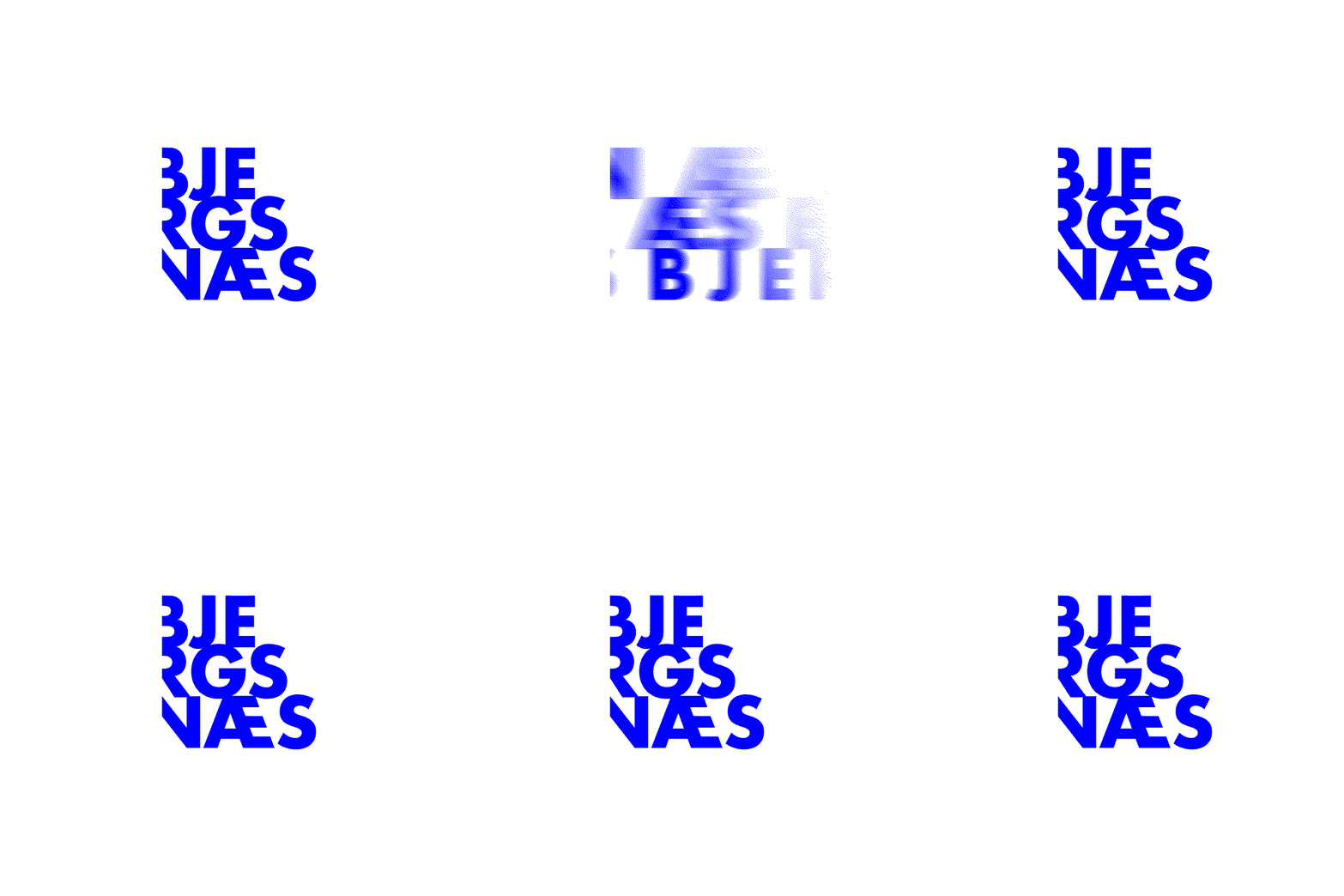
Bjergsnæs already had a distinctive logo with strong recognition among the school’s target audiences. The aim was therefore to refine the existing logo and bring the school’s focus on movement to the fore.
The logo was fine-tuned, and the box that had previously enclosed it was removed. A simple change that unlocks the logo’s full dynamism, giving it more freedom and movement.
Brand platform
The visual identity is built on a strategic foundation that brings the school’s values together and sharpens their focus.
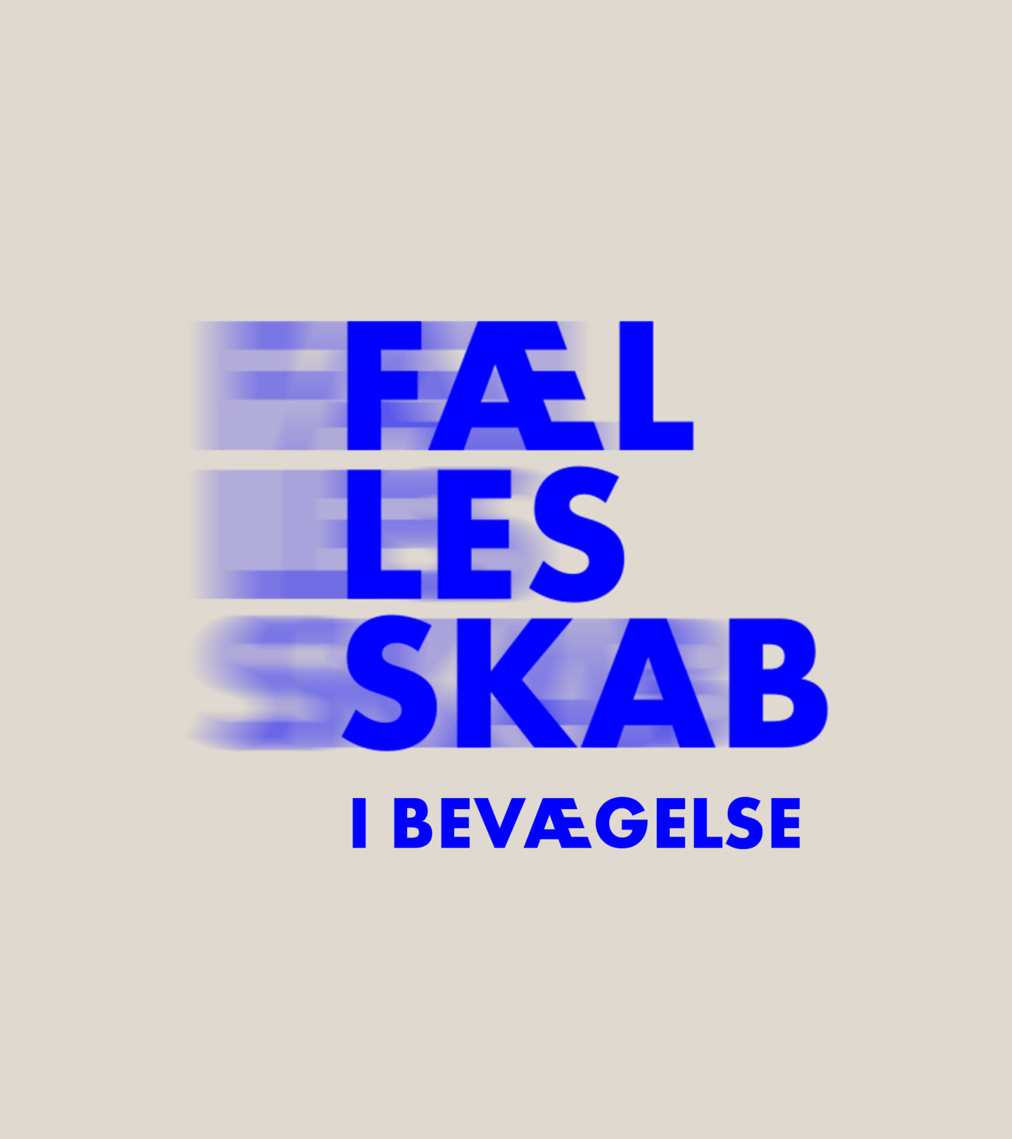
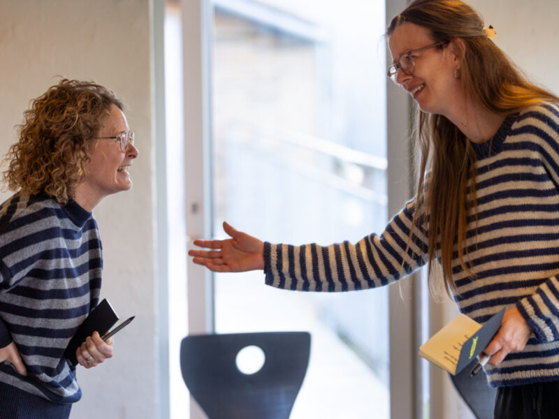
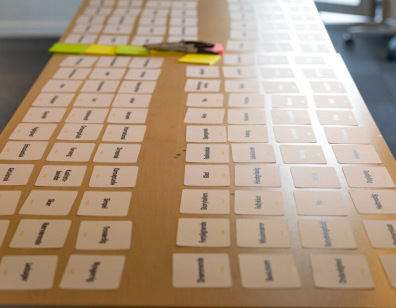
At its core is “Present growth, within a committed community,” grounded in presence, courage and integrity. It embraces care and inclusivity, a desire to grow and the courage to take new paths, as well as the ambition to do one’s best and take responsibility.
This gives Bjergsnæs a strong foundation. A foundation that can be felt in everyday life and actively expressed in the school’s communication.





Font
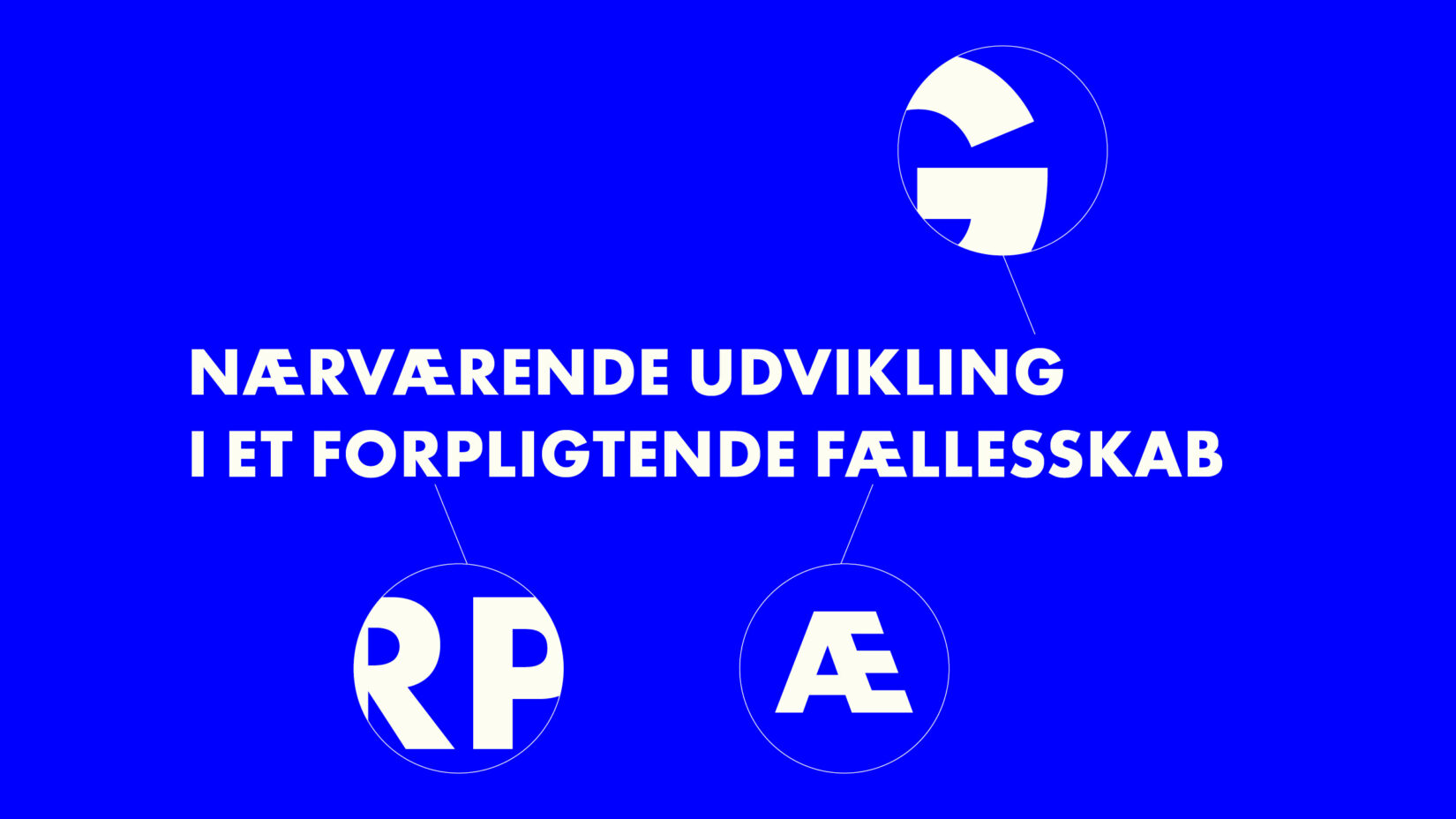
Typography supports the balance between progress and presence.
Futura PT is the distinctive primary typeface. Its geometric forms are simple, modern and bold, making it especially effective in large headlines where the identity needs energy and impact.
Roboto Serif provides contrast in longer texts. It brings a sense of calm and is highly readable, reflecting the integrity that is also central to Bjergsnæs.
Design
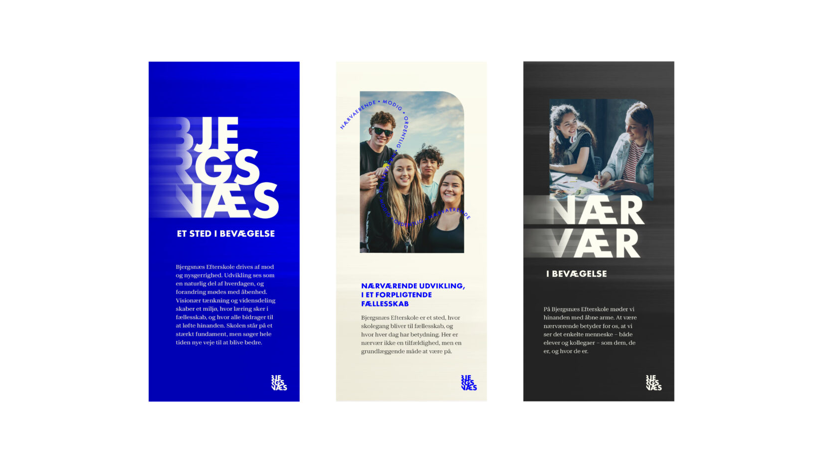
The identity includes a flexible toolkit of graphic elements, all rooted in the idea of movement.
Words and messages can follow organic lines through the layout, creating a sense of constant momentum. Motion blur and speed stripes add pace and energy, while the movement effect can also be applied to the logo and headlines.
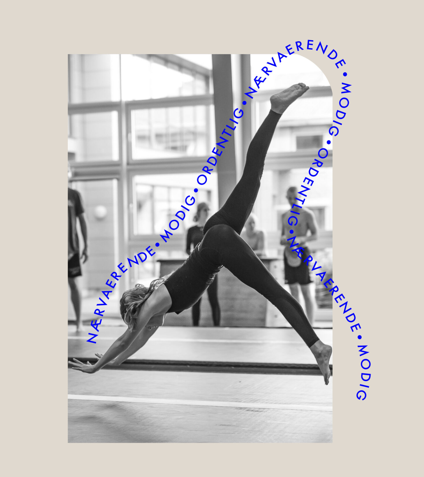
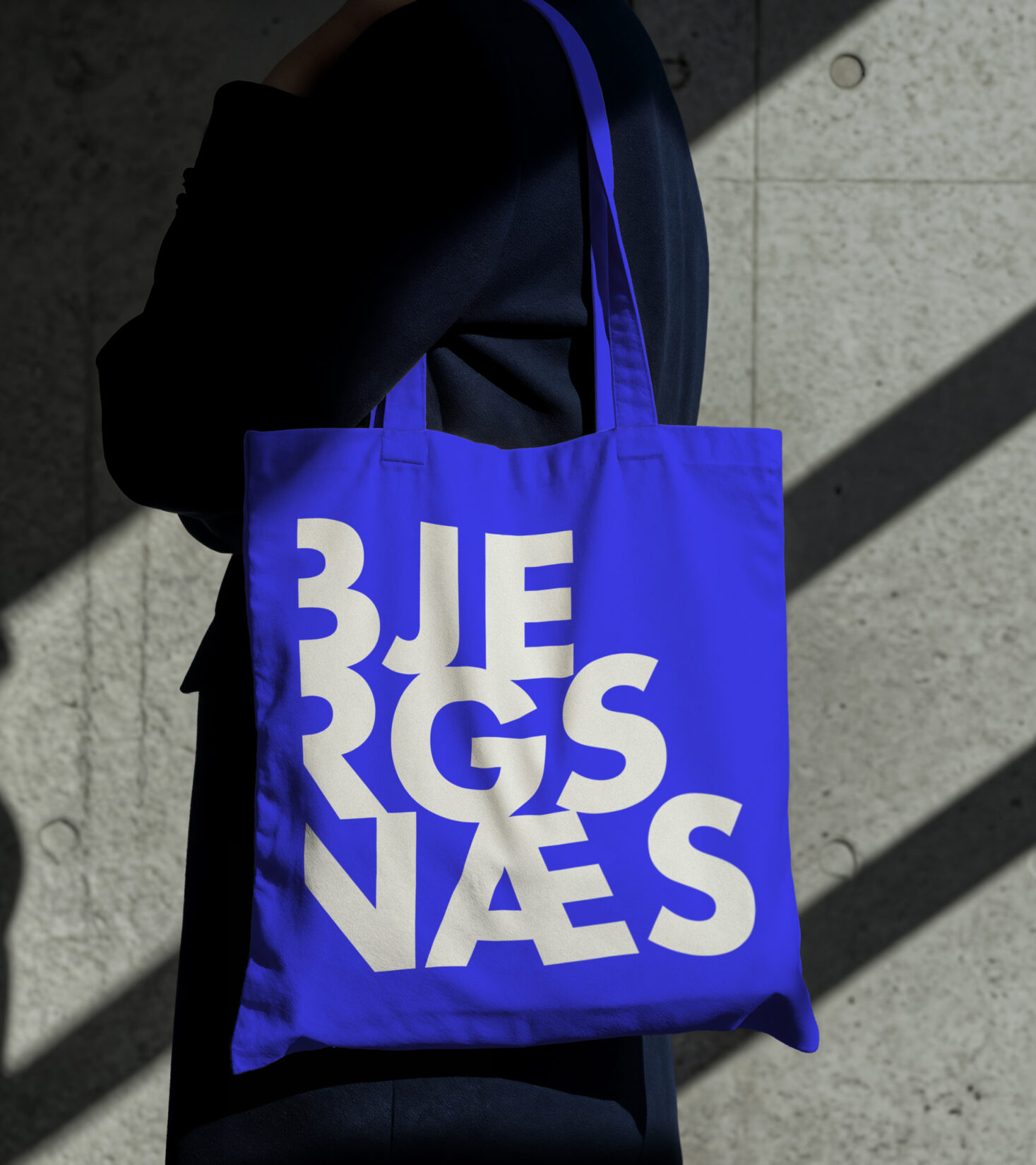

The elements can be dialled up or down to suit the format and message. This gives Bjergsnæs a lively visual language that’s always in motion.
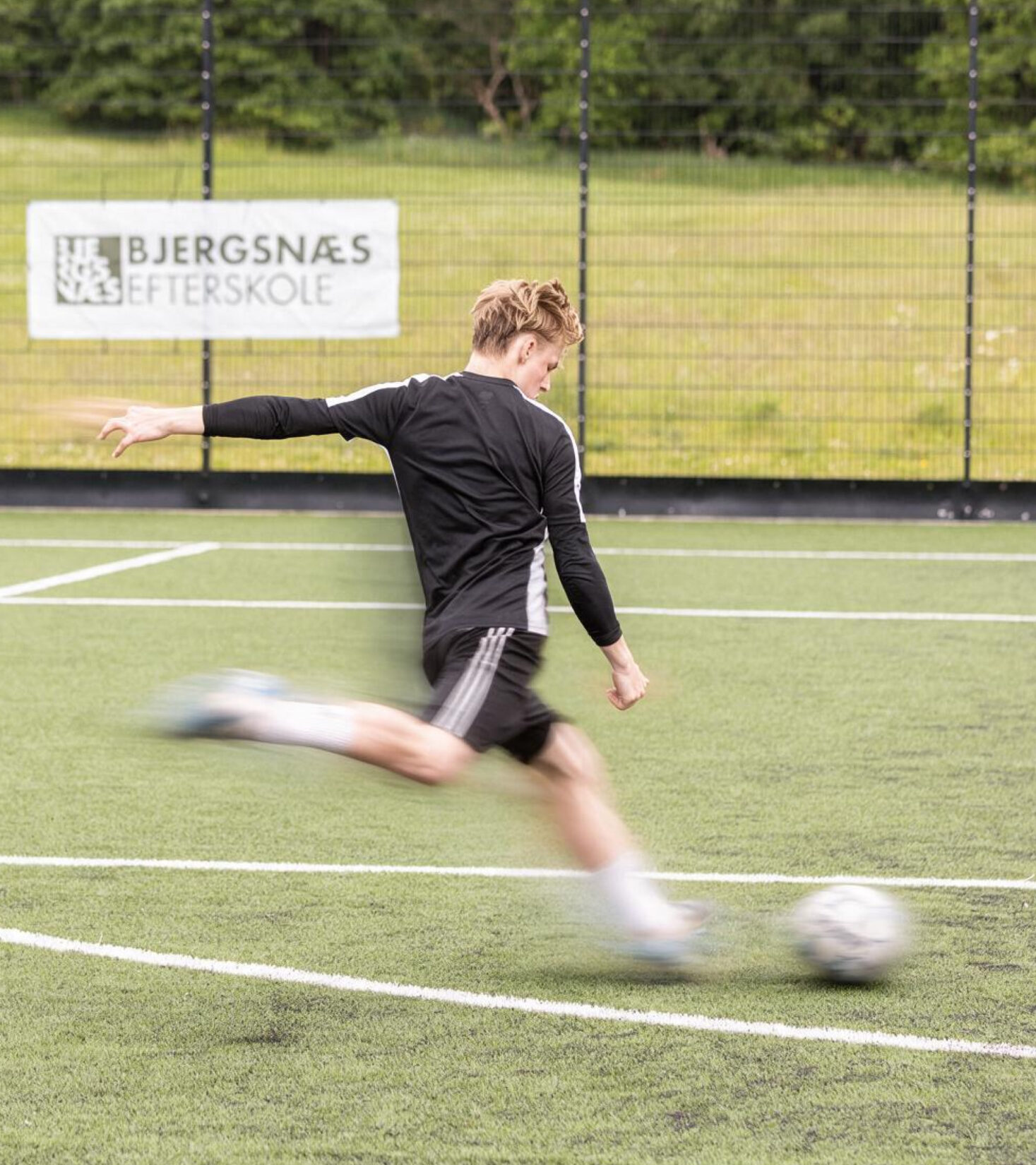


Website
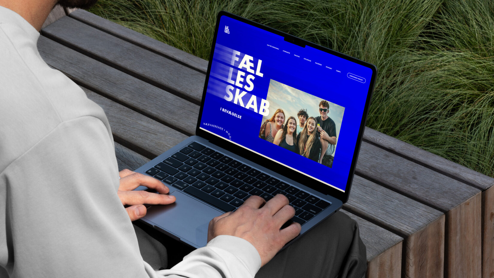
On the web, the different elements come together in a unified digital experience. Bold typographic messages, imagery, colour and motion effects give Bjergsnæs a distinctive look from the very first interaction.
The identity is also designed as a flexible system that works across the website, social media, print, merchandise and the school’s other touchpoints.