Danhostel
rebranding & new visual identity
How do you revitalise one of Denmark’s most recognised brands without losing what has made it strong across generations?
That was the challenge we were invited to take on when Danhostel set out to renew its brand and move beyond outdated perceptions of hostels as dormitories and stale stereotypes.
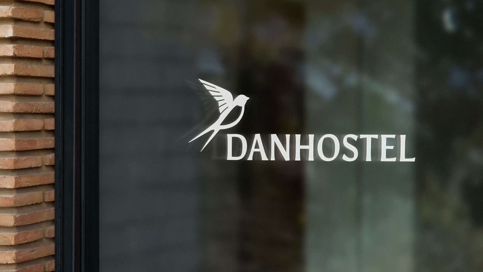
Through a strategic identity process, we developed a new visual identity that bridges Danhostel’s proud heritage with its ambitions for the future. With the swallow as its unifying symbol, the identity tells a new story of movement, community, and places people return to again and again.
- Brand Campaign
- Brand Communication
- Brand Design
- Brand Guardianship
- Brand Guidelines
- Brand Identity
- Brand Research
- Brand Strategy
- Concept Development
- Edit & Retouch
- Film Production
- Graphical Elements
- Logo Design
- Photo Shoot
- Post Production
- Social Media & Content
- Tagline Development
- Visual Storytelling og Communication
Challenge
CHALLENGING PRECONCEPTIONS
For many people, the word hostel still brings to mind dorm rooms and outdated stereotypes.
That was exactly the perception Danhostel wanted to challenge. Because the reality looks very different today. Danhostel is now a network of more than 50 unique destinations, offering modern facilities, strong local stories, and hosts who create experiences defined by warmth, authenticity, and personality.
The problem was that the story of Danhostel had not kept pace with its development.
Solution
STARTING WITH INSIGHT
To create an identity that reflects the Danhostel of today, we began with interviews and analysis to gain a deeper understanding of the organisation’s DNA, strengths, and potential. These insights were translated into a new brand story and visual identity, bringing together the chain’s many hosts and local stories under one shared direction.
With the swallow as a unifying symbol and a flexible identity system, we created a brand that shifts the focus away from outdated perceptions of hostels and towards what Danhostel wants to be known for: authentic experiences, meaningful hospitality, and places with a story.

Insight came before identity
To create an identity rooted in reality, we didn’t start with design. We started with insight.
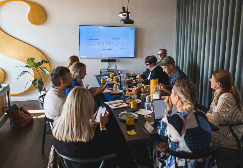
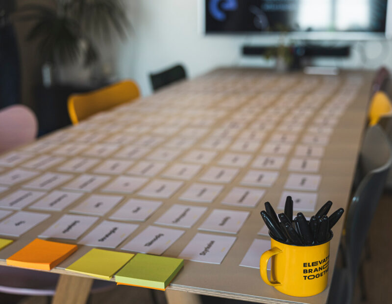
Through workshops with both the board and members, as well as in-depth interviews and analyses conducted in collaboration with Epinion, we explored what defines Danhostel’s DNA, how the chain is perceived by members and guests, and what potential the brand holds for the future.
These insights became the foundation of the new identity. An identity that both respects Danhostel’s heritage and strengthens the values that have made the chain unique across generations.
At the same time, it opens the door to a more contemporary narrative that reflects the reality and experiences Danhostel offers today.





A symbol of movement and belonging
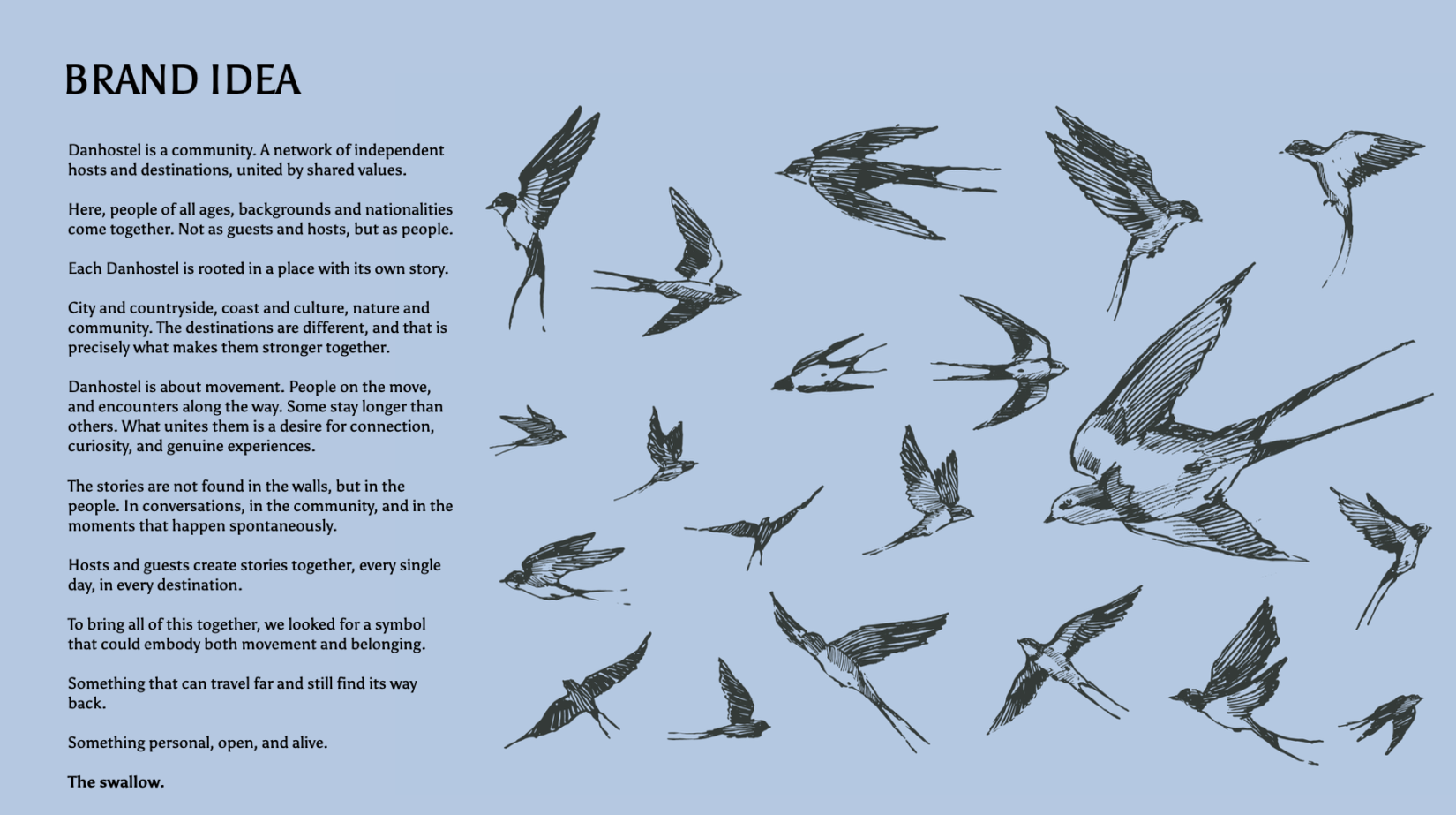
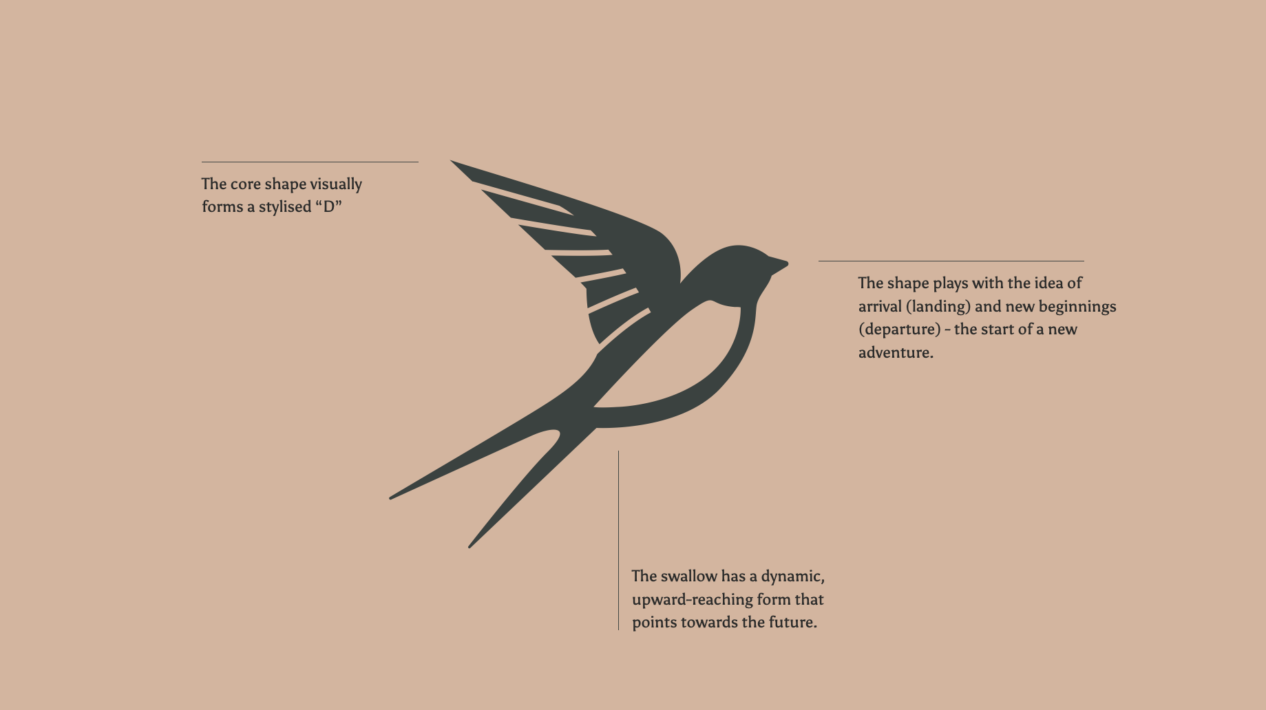
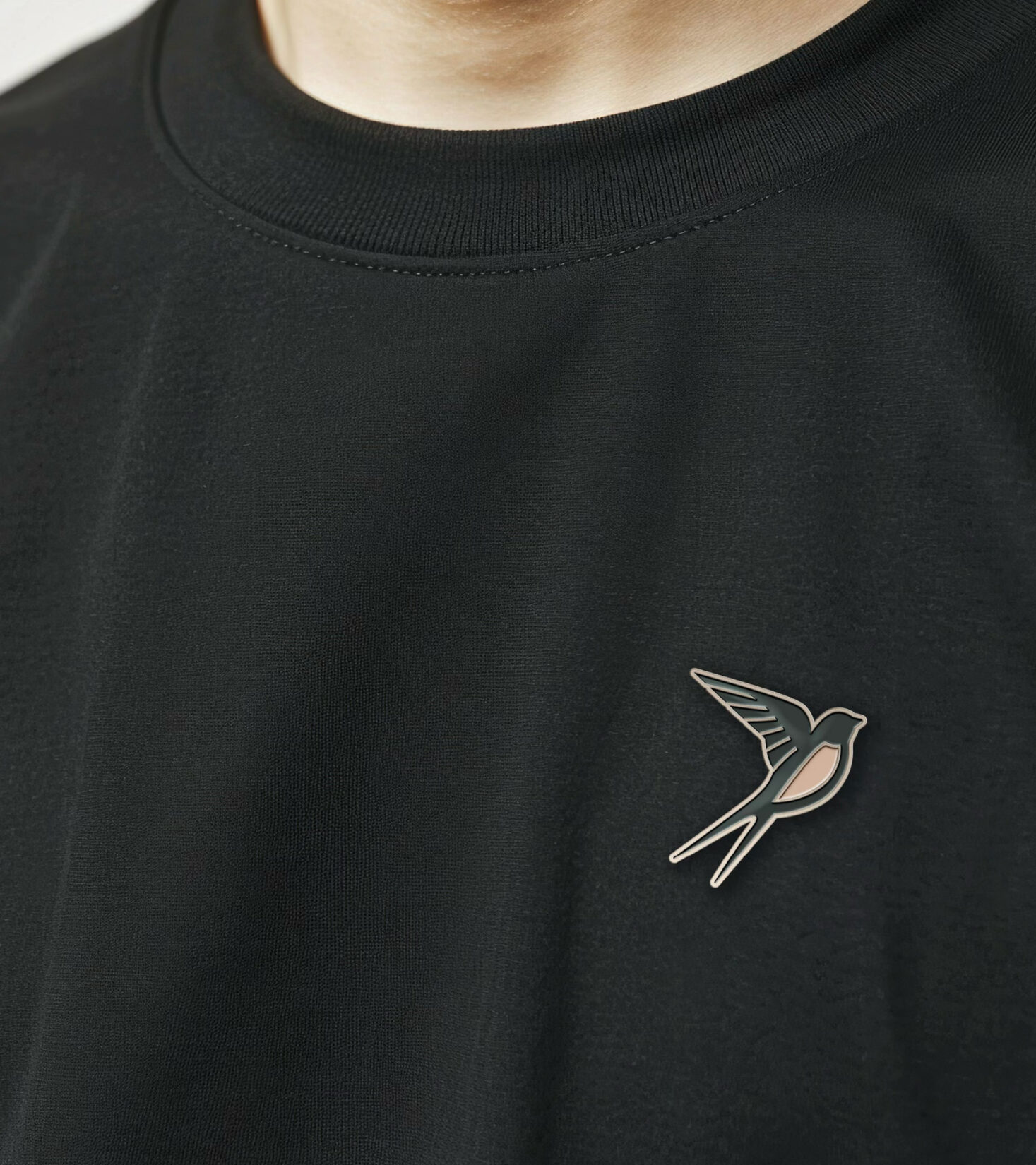
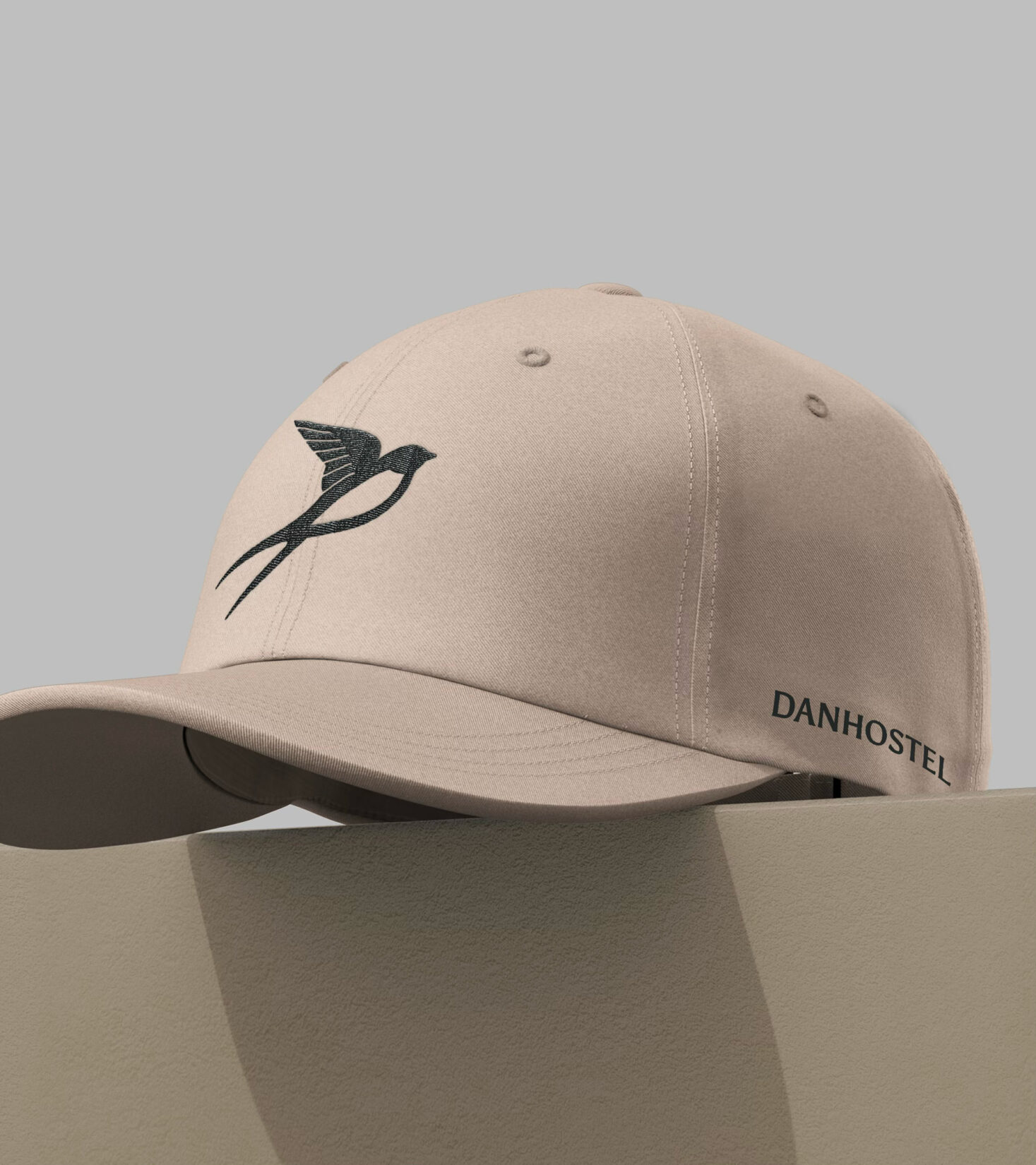
At the heart of the identity is the swallow. It moves across places and countries. It stays close to people. And it returns again and again, much like many of Danhostel’s guests.
As a symbol, it represents both movement and belonging. New experiences and familiar places. It tells the story of being on a journey, while also having a place to belong.
An identity with room for both heritage and future
The result is an identity that strengthens Danhostel’s position as a modern network of destinations, each with its own distinctive character, yet united by a shared focus on hospitality, connection, and memorable experiences.


A flexible identity system
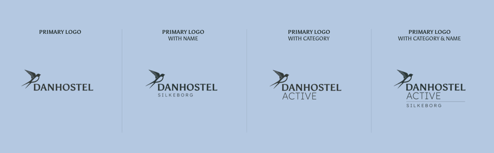
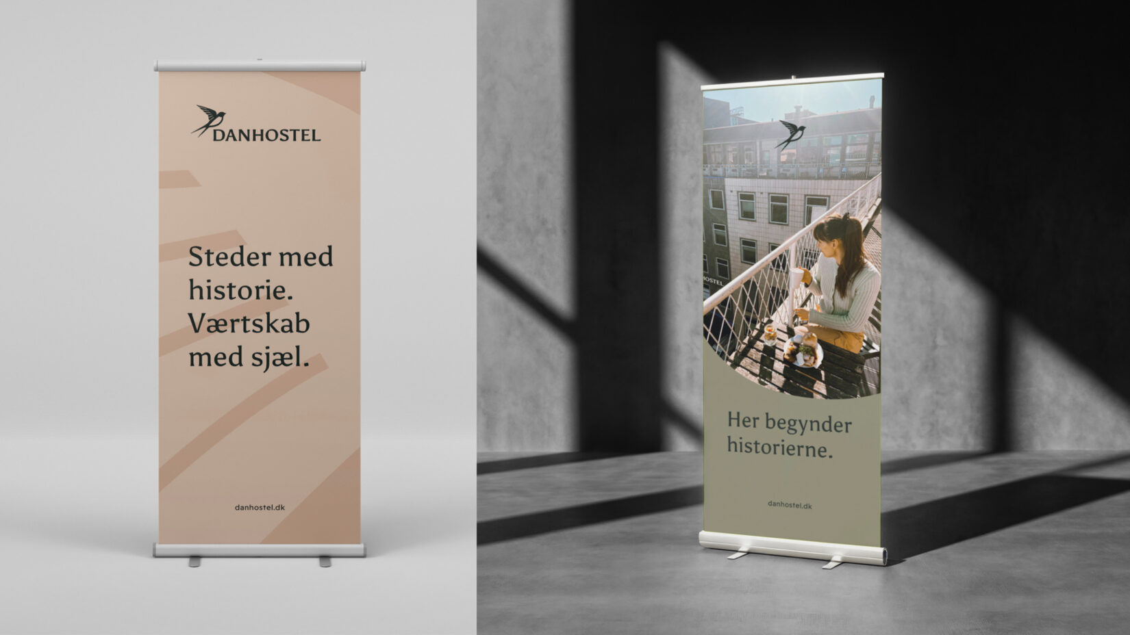
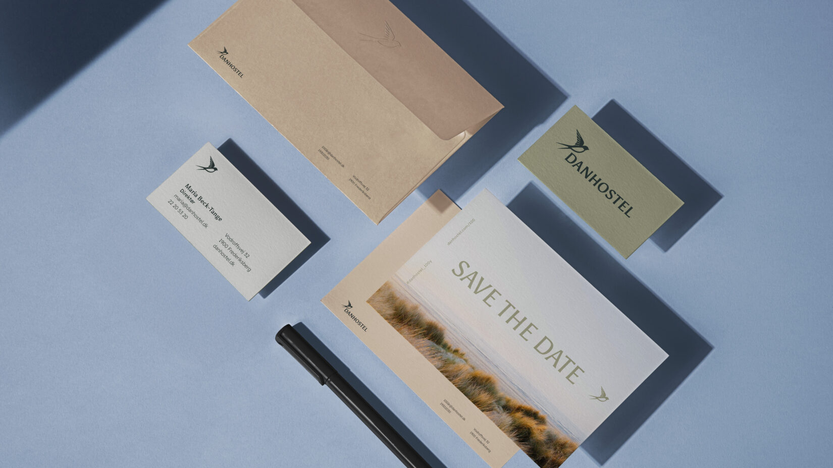
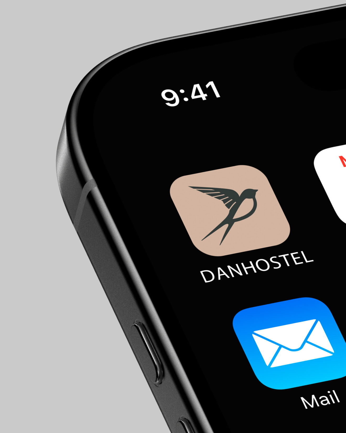
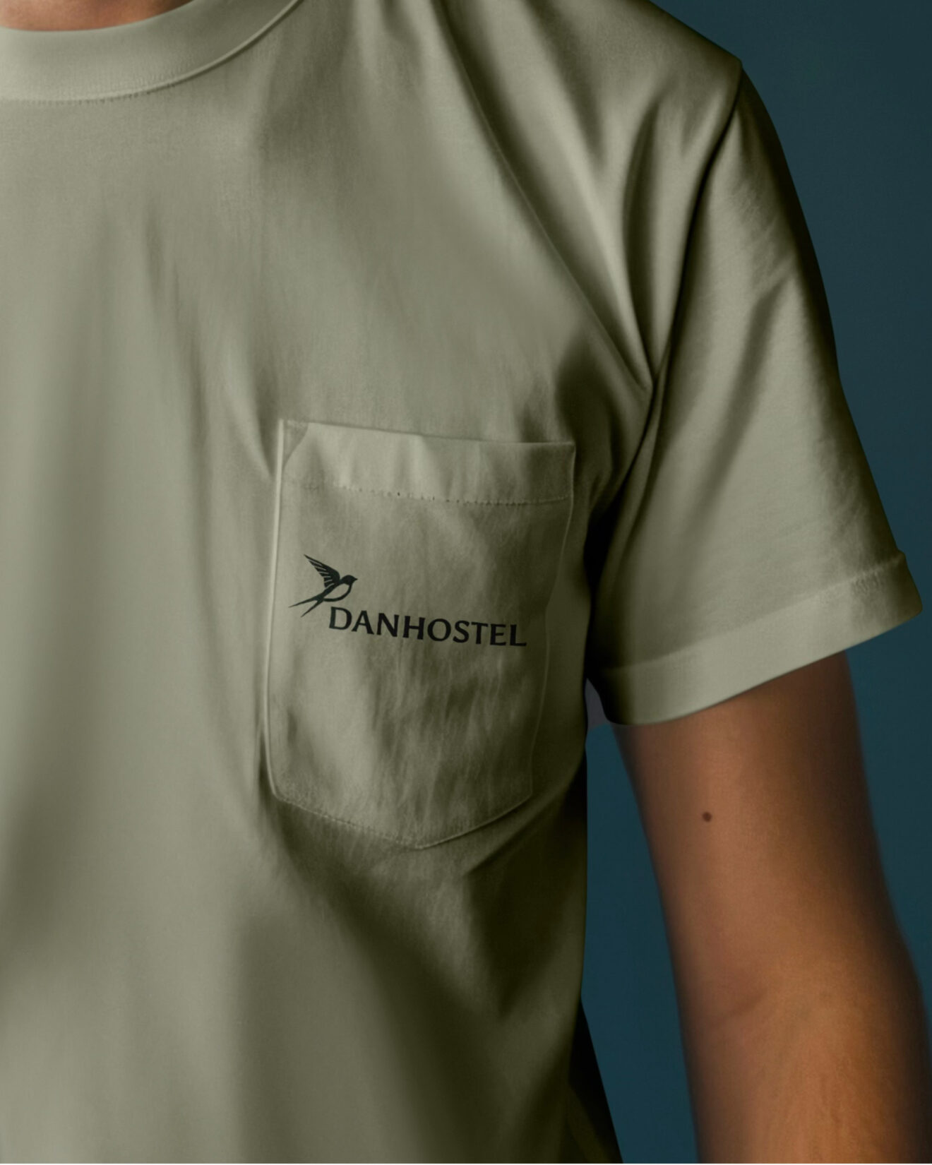
The new identity has been designed to work across Danhostel’s many destinations and offerings. The logo can therefore be adapted with both location names and categories, allowing each destination to maintain its own character while remaining a clear part of the overall Danhostel brand.
The result is a flexible and scalable identity system that creates consistency and cohesion across the entire network.
Human brands always want to be both unique and part of something bigger at the same time. Against all odds, this one actually manages to do both.

A visual system with room for diversity
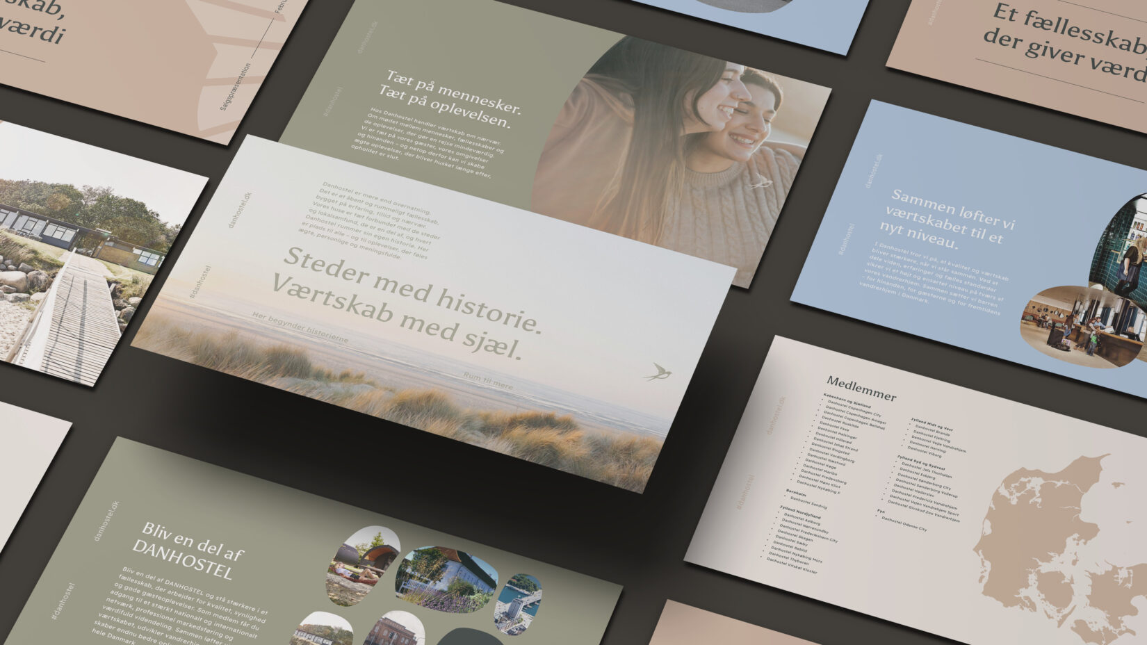
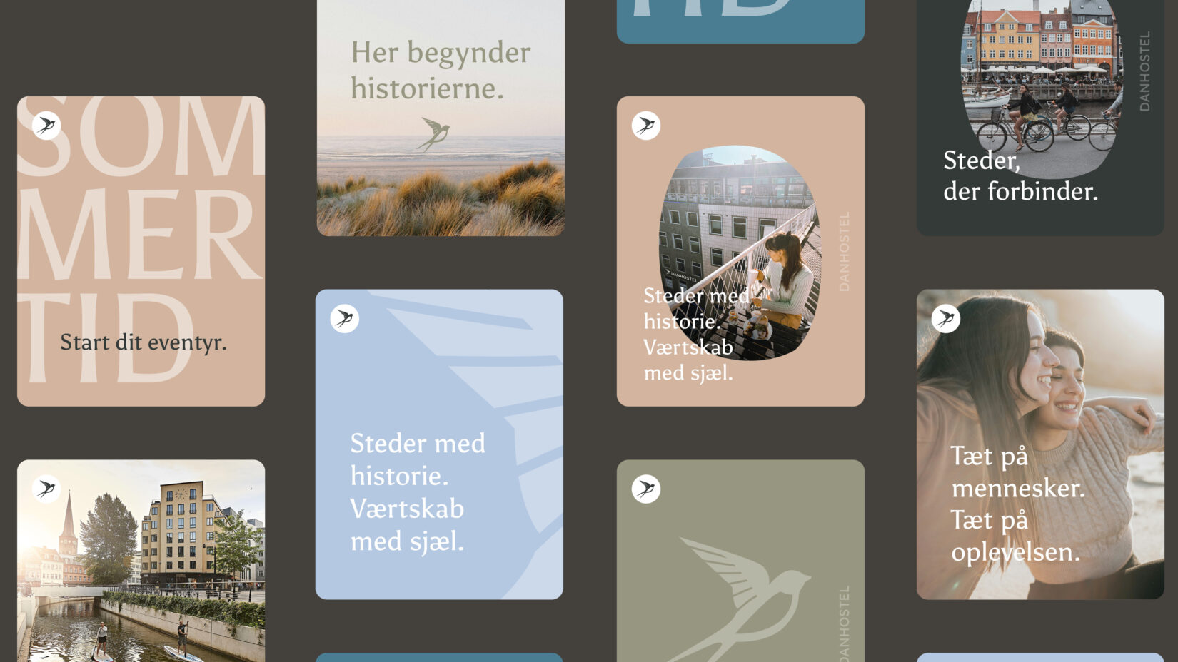
Each Danhostel has its own story, surroundings, and approach to hospitality. That is why the identity was developed as a flexible system that creates a strong and consistent brand presence while leaving room for the local character and personalities that make each destination unique.
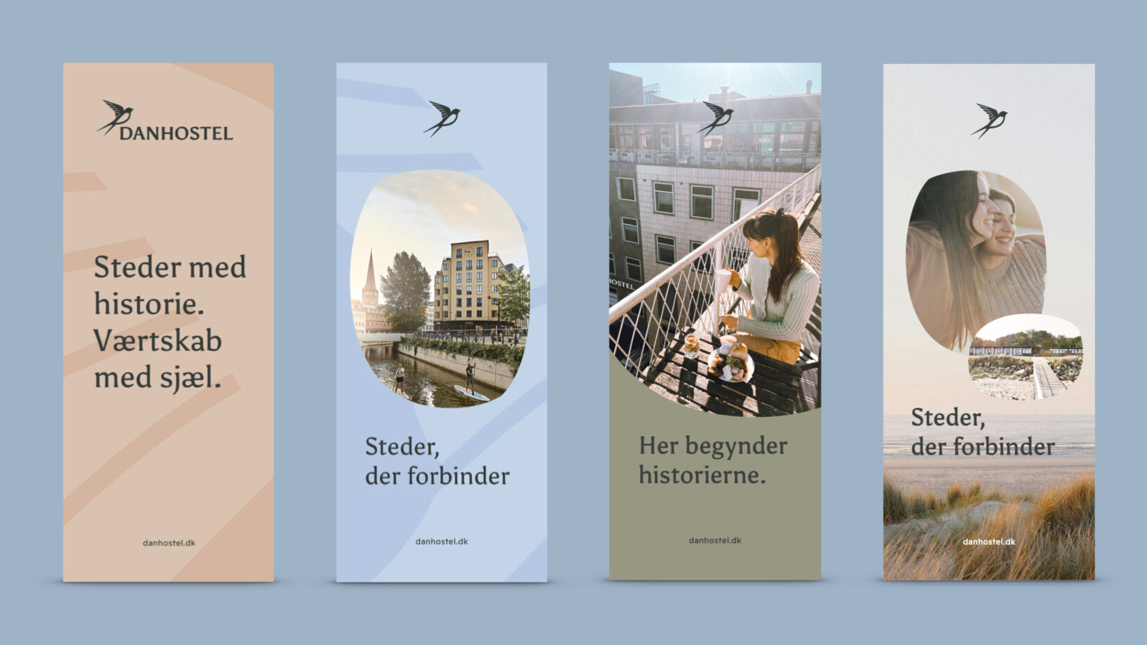
The organic shapes are inspired by the swallow’s distinctive wingbeat and serve as a recurring graphic element throughout the identity.
They can be used to frame imagery, highlight messages, and create graphic compositions, giving Danhostel a vibrant and recognisable visual expression across all touchpoints.
Colours rooted in the surroundings
Danhostel is not a single place. It is a network of more than 50 destinations, each with its own setting, atmosphere, and story. That is why the new colour palette was developed to reflect this diversity.
The colours are inspired by the landscapes and environments that surround Danhostel’s destinations. Sky, sea, clay, forest, and dawn. Together, they create a warm and vibrant expression that embraces nature, cities, and the many experiences guests encounter along the way.
The palette allows for variation and local storytelling while also bringing the entire network together under one shared identity.

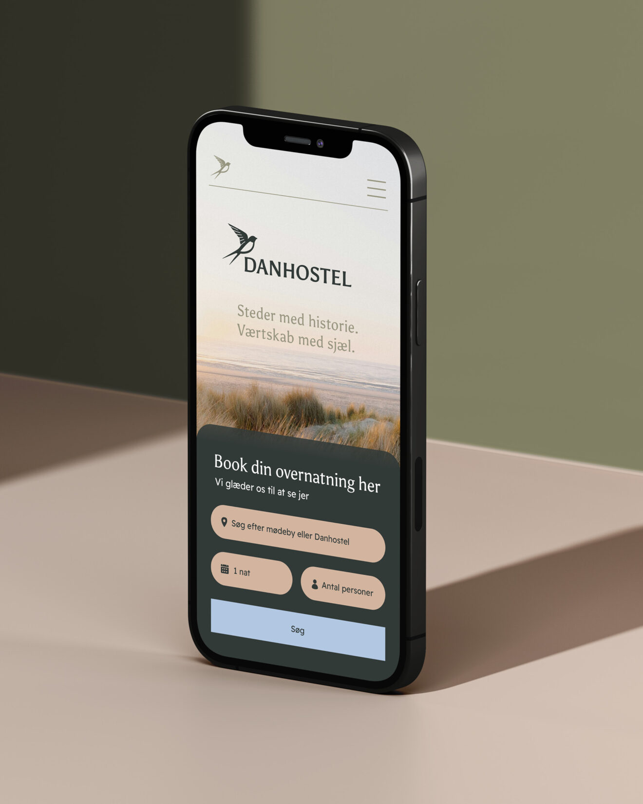
Places with history. Hospitality with soul.
Danhostel is made up of more than 50 unique destinations, each with its own history, surroundings, and hosts. That is why the new identity is built around what unites them: authenticity, community, and experiences that leave a lasting impression.
The brand platform is brought together through the promise Places with a story. Hospitality with soul., shifting the focus from price to experience. Because Danhostel should not primarily be known for affordable accommodation. It should be known for the places, people, and moments that make every stay memorable.